UX Research • Case Study
research.pitt.edu
Usability Evaluation
Project summary
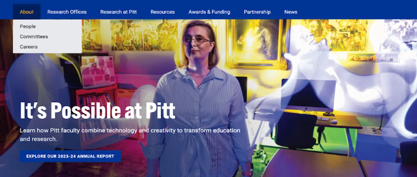
Following a major redesign of research.pitt.edu — Pitt's central hub for research communication — the team was commissioned by the Senior Director of Communications to assess how well the updated site served its users. Using a multi-method research approach, we identified critical usability gaps: unclear navigation, confusing terminology, and a homepage that failed to communicate the site's purpose. Our findings and prioritized recommendations give the development team a clear roadmap for improvement.
- Heuristic Evaluation
- User Testing
- Think-Aloud
- SUS Questionnaire
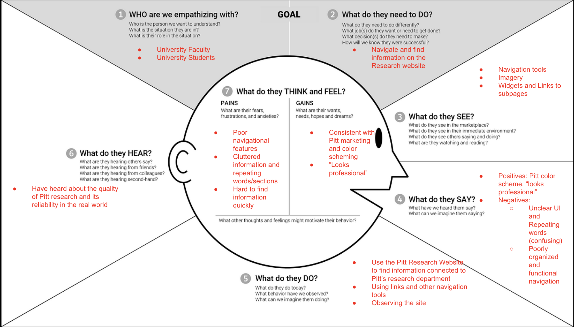
- Empathy Mapping
- Siteimprove
Research methods & rationale
-
Heuristic evaluation
Applied Nielsen's 10 usability heuristics and the Pascarella–Quigley accessibility framework to systematically audit the site before any user contact.
Why: Catches structural issues cheaply and early, giving us a hypothesis-driven starting point for user testing.
-
Think-aloud user testing
Participants verbalized their thoughts while completing two scenario-based tasks on the live site, conducted in-person and over Zoom.
Why: Reveals the gap between designer intent and actual user mental models in real time.
-
SUS questionnaire
After each session, users completed a standardized System Usability Scale survey to produce a comparable, quantifiable usability score.
Why: Provides a benchmarkable metric that complements qualitative findings and is widely recognized by stakeholders.
-
Siteimprove audit
A cloud-based scan assessed accessibility compliance, SEO, broken links, and content quality across the entire site automatically.
Why: Uncovers technical issues — missing alt text, broken links — that traditional observation would miss.
-
Empathy mapping
Before testing, we constructed a structured empathy map to surface assumptions about user emotions, goals, frustrations, and behaviors.
Why: Aligns the team on a shared user perspective and sharpens interview questions and scenario design.
-
Transcript analysis
All sessions were recorded and transcribed. We coded transcripts for recurring themes, user quotes, and task-failure patterns.
Why: Triangulates subjective impressions with direct user language, making findings defensible to stakeholders.
Research process
-
Client discovery & goal-setting
Met with the Senior Director of Communications to define four goals: understanding faculty pain points, clarifying navigation, improving consistency, and enhancing visual appeal.
-
Heuristic & Siteimprove audit
Conducted an expert review using Nielsen's 10 heuristics alongside the Pascarella–Quigley accessibility framework, with a parallel Siteimprove scan for technical issues.
-
Empathy map & script development
Built an empathy map around primary users (research faculty and potential faculty). Developed a standardized testing script to ensure consistency across all participant sessions.
-
Participant recruitment
Recruited a diverse mix of university stakeholders: Undergraduates Graduate students Research assistants Research faculty
-
Moderated user sessions
Participants completed two scenario-based tasks using the think-aloud method, followed by behavioral and reflective interview questions and a SUS questionnaire.
-
Analysis & triangulation
Coded transcripts to extract themes. Cross-referenced qualitative observations, SUS scores, heuristic findings, and Siteimprove data to produce a prioritized recommendation set.
Key findings from testing
- Homepage failed to communicate the site's purpose or audience
- Navigation sent users to external Pitt sites with no warning or way back
- "Pitt Research Concierge" label confused users expecting hotel-style services
- Search bar hidden by a Zoom widget, causing one user to miss it entirely
- Color scheme, typography, and tile layout received consistent praise
- "By the Numbers" section purpose was unclear to most users
- Annual report table of contents lacked sufficient context
- Users requested a clear "About" page explaining Pitt Research's mission
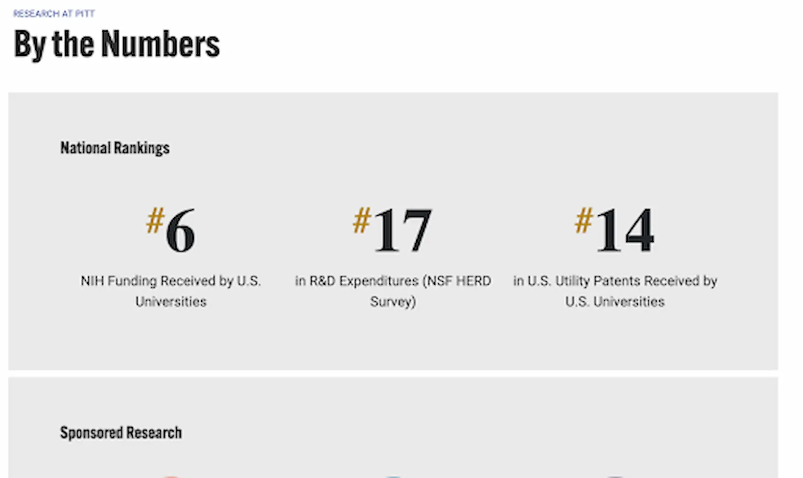
"I had no idea what I was about to do on this... it's not very informative."
Recommendations
-
High priority
-
Clarify navigation labels
Replace ambiguous terms like "Pitt Research Concierge" with plain-language equivalents such as "Research Resources & Services" to reduce user confusion and failed searches.
-
Consolidate into one site
Integrate externally linked resources — including the annual report — into research.pitt.edu so users never lose their place or get stranded on a separate domain.
-
-
Medium priority
-
Simplify the menu structure
Flatten the navigation hierarchy and relocate the search bar to a prominent, unobstructed position aligned with the tab bar to improve discoverability.
-
Add a clear "About" page
Create a dedicated page explaining Pitt Research's mission, audience, and key offerings so new visitors immediately understand the site's purpose.
-
-
Low priority
-
Use research-relevant imagery
Replace generic hero photos with images that authentically depict Pitt's research work, aligning visual content with user expectations and site purpose.
-
Show persistent breadcrumbs
Display the user's navigation path at all times — especially when deep in the site — to reduce disorientation and support wayfinding across multiple pages.
-
Remove redundant hamburger menu
Hide the mobile hamburger icon when full desktop tabs are visible to eliminate visual clutter and reduce confusion about which navigation to use.
-