UX Research • Case Study
ChatGPT Heuristic Evaluation
- 10 Nielsen-Molich usability heuristics applied
- 11 dimensions in the custom accessibility framework
- 3 audit tools, manual and automated
- 5 prioritised recommendations
Project summary
A structured heuristic evaluation of ChatGPT conducted as part of a university UX course. Using Nielsen's 10 usability heuristics alongside a custom accessibility framework, I systematically examined ChatGPT's interface across usability, visual design, and inclusive design dimensions. The evaluation uncovered meaningful gaps — particularly in keyboard navigation and user control — while confirming ChatGPT's considerable strengths in conversational design and aesthetic clarity.
- Solo researcher
- University course
- Nielsen-Molich heuristics
- Custom accessibility framework
- Screen reader testing
- Lighthouse
Project overview
ChatGPT is a generative AI chatbot developed by OpenAI, used widely by students, professionals, and content creators for writing, summarising, question answering, and image generation. This evaluation assessed ChatGPT from the perspective of a technology-literate college student, with the goal of identifying usability and accessibility improvements that could benefit all users, including those with disabilities.
Process & methodology
The evaluation ran across two parallel tracks — a usability audit using the Nielsen-Molich heuristics, and an accessibility audit using a custom framework — supported by direct hands-on interaction and automated tools.
-
Track 1 — Nielsen-Molich usability heuristics
I evaluated ChatGPT against all 10 Nielsen-Molich heuristics through structured interface walkthroughs, identifying strengths and shortcomings and capturing evidence via screenshots.
-
Track 2 — Custom accessibility framework
A custom framework covering 11 dimensions: layout, design elements, colour, font and text, text organisation, buttons and links, images, media, navigation, forms, and keyboard navigation.
Tools
- Apple VoiceOver — screen reader compatibility and element labelling
- Chrome Lens — visual accessibility and colour contrast
- Google Lighthouse — automated performance and accessibility metrics
Usability findings
All ten heuristics, rated. ChatGPT scores strongly wherever the conversation itself is the interface, and drops to adequate wherever the user needs to take control of it.
| Heuristic | Key finding | Rating |
|---|---|---|
| Visibility of system status | Real-time generation, animated dots, and status indicators clearly communicate system state. | Strong |
| Match with the real world | Conversational tone mirrors natural dialogue; user memory reinforces this metaphor. | Strong |
| User control & freedom | Stop and edit functions present, but the regenerate button is hard to find and stopped responses can't be resumed. | Adequate |
| Consistency & standards | Follows familiar web conventions — sidebar left, settings top-right, centred input. | Strong |
| Error prevention | Few technical errors, but AI responses are sometimes inaccurate. Users must verify outputs independently. | Adequate |
| Recognition over recall | Conversation history saved in the sidebar. Some icons, such as the version switcher, are ambiguous. | Adequate |
| Flexibility & efficiency | Supports text and voice input, custom GPTs, and model switching — but most features are only accessible one way. | Adequate |
| Aesthetic & minimalist design | Clean black-and-white layout with generous whitespace keeps focus on the chat. | Strong |
| Error recognition & recovery | Warnings about unreliable responses are displayed; the AI helps users identify and correct prompt mistakes. | Strong |
| Help & documentation | Help menu in the bottom-right corner; ChatGPT can answer help questions on demand. | Strong |
User control and freedom
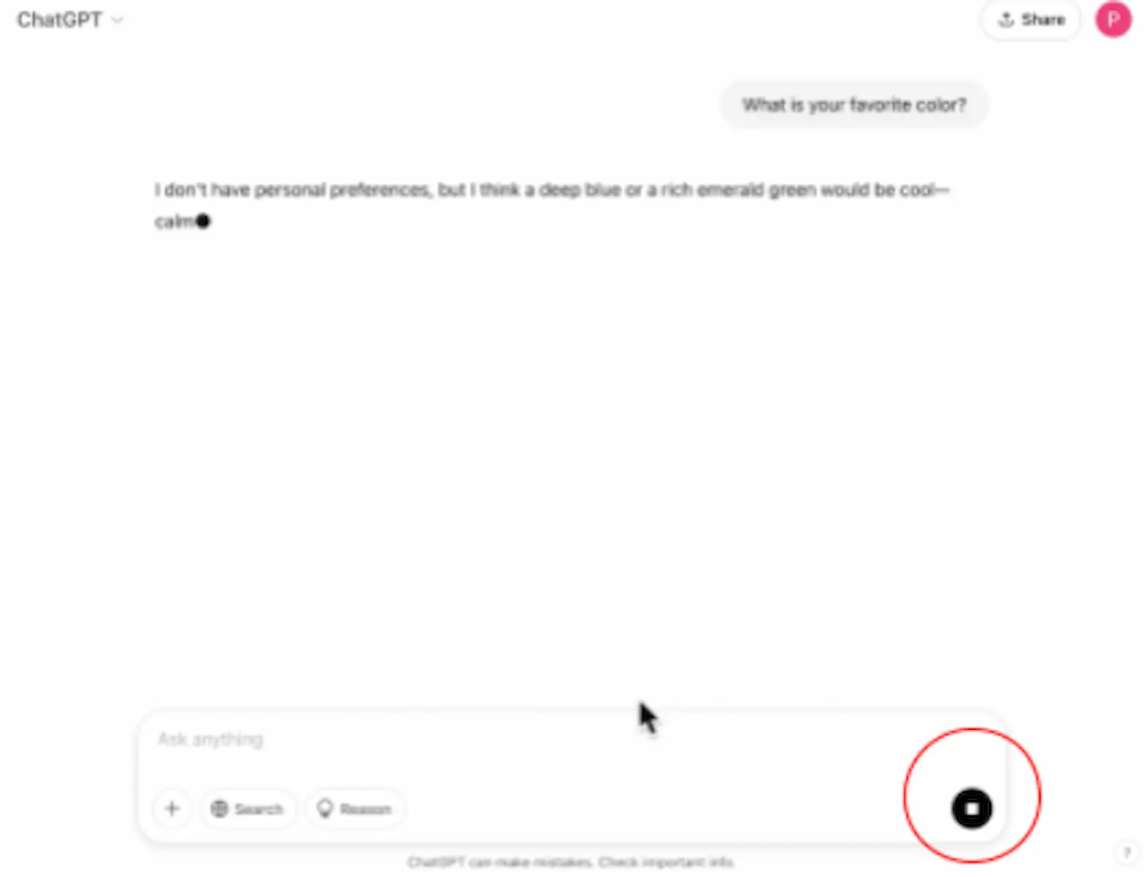
This was the weakest of the ten. The controls that exist are good: generation can be stopped mid-response, prompts can be edited and resubmitted, and previous versions of an answer can be switched between. The problem is what happens after you use them — a stopped response cannot be resumed, only regenerated from the start, and the regenerate control itself is buried.
Help and documentation
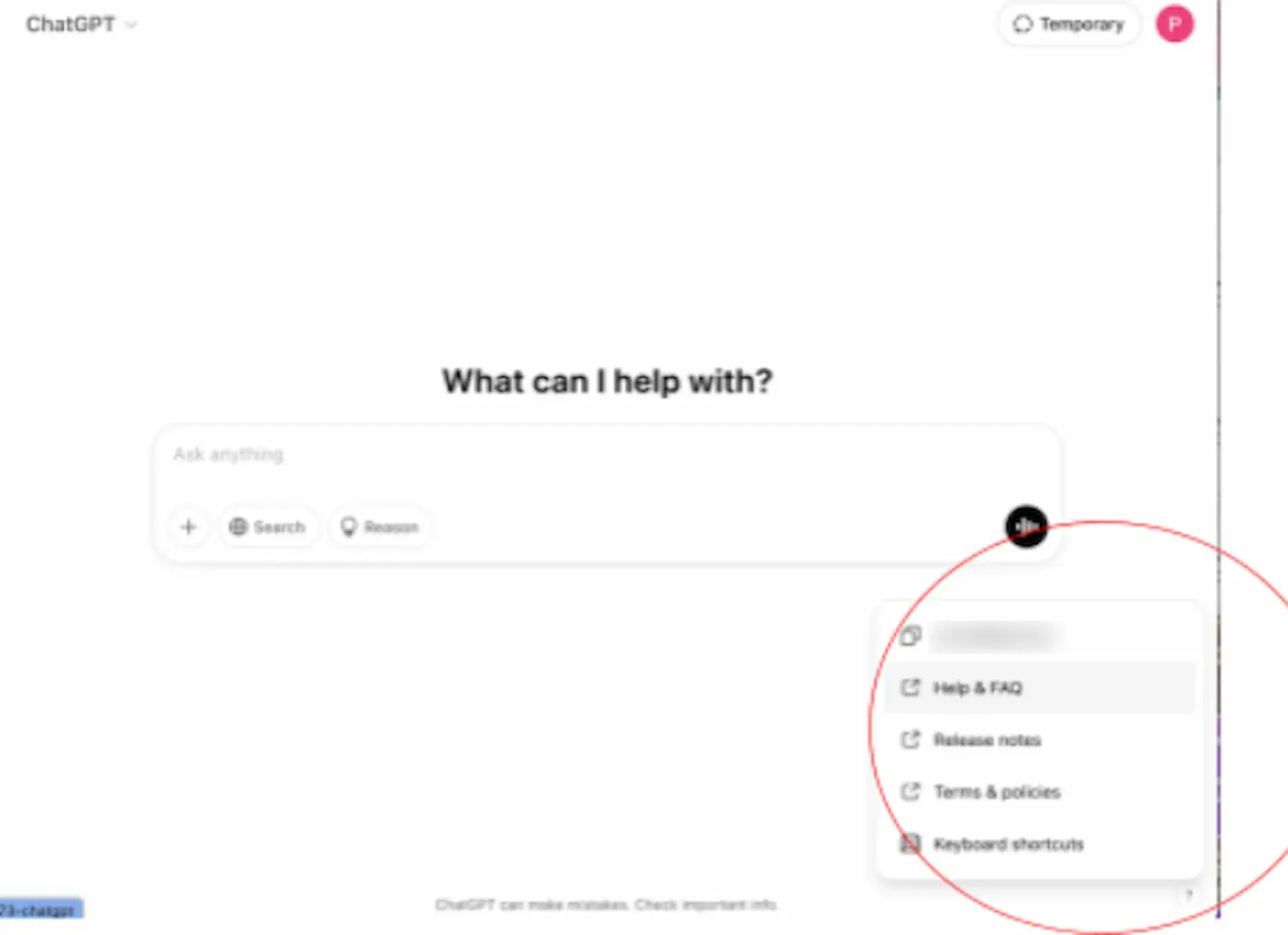
One of the stronger heuristics. Help is reachable from a persistent control in the bottom-right corner, and the menu covers the documentation a new user would look for. ChatGPT can also answer questions about itself directly in the conversation, which means help is available without leaving the interface at all.
Accessibility findings
The custom framework's eleven dimensions produced a split result: ChatGPT is well built for users who can see and read the interface comfortably, and noticeably less so for users who depend on the keyboard or need to adjust the text.
Strengths
- Screen reader compatibility — VoiceOver navigated effectively; elements correctly labelled
- Responsive layout — all elements remained visible across screen sizes
- Visual design — high-contrast palette supports low-vision users
- Multimodal interaction — voice mode supports users who struggle with text input
Weaknesses
- Keyboard navigation — links and past chats didn't highlight during keyboard focus; some buttons required two Tab presses
- Font & text customisation — no options to adjust font size or style
- Alt text — AI-generated images lack alt attributes, though in-line captions are included
- Text organisation defaults — structured formatting required explicit prompting from the user
Text organisation
Of the eleven dimensions, text organisation was the clearest example of a default working against accessibility. Asked to summarise a book, ChatGPT returns dense unbroken paragraphs. Asked immediately afterwards to organise the text better, it produces the same content with headings, labelled sections and bulleted lists — far easier to scan, and far friendlier to assistive technology.
The information was never the problem. The structure was available the whole time; it simply wasn't the default, which puts the burden on the user to know to ask.
-
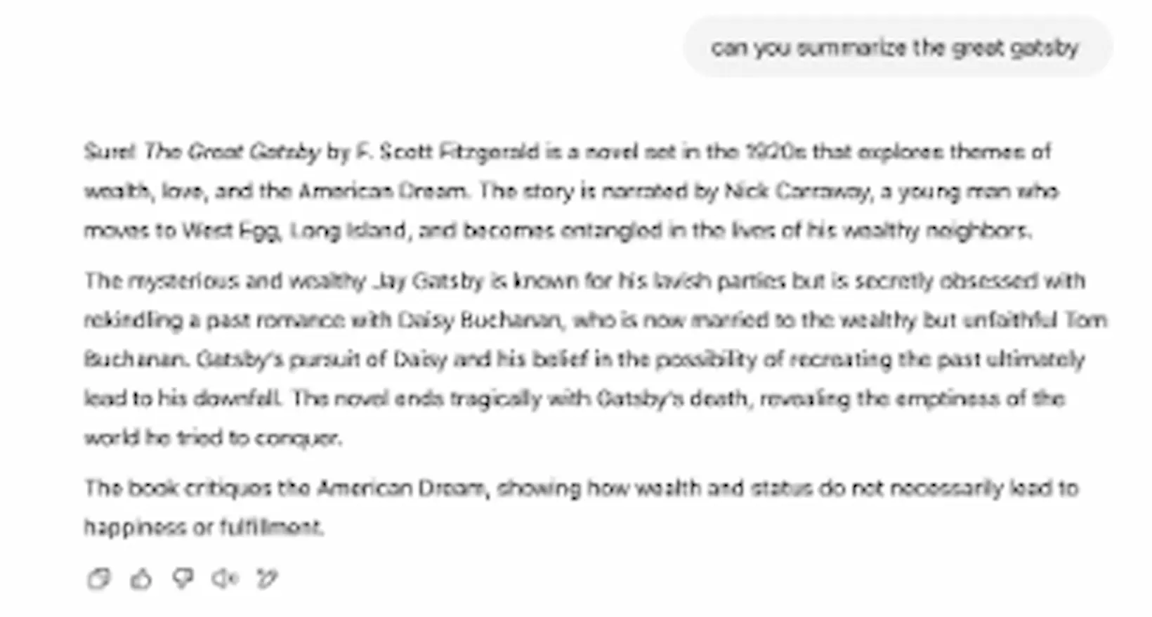
Before. The default response — three unbroken paragraphs with no structure to scan. -
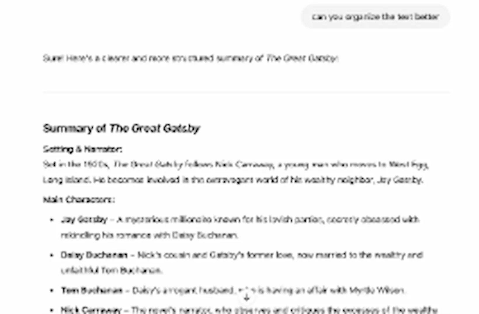
After. The same content with headings, labelled sections and bullets — produced only after the user asked for it.
Recommendations
-
High priority
-
Fix keyboard navigation
Visually highlight focused elements, and make every button reachable with a single Tab press rather than two.
-
Restore the regenerate button
A clearly labelled, easily found regenerate option would significantly improve user control after a response is stopped.
-
-
Medium priority
-
Multiple navigation paths
Key sections should be reachable more than one way, rather than through a single entry point each.
-
Font and text size controls
Basic type adjustments would improve accessibility for users who cannot comfortably read the fixed default.
-
-
Low priority
-
Dark mode
An expected feature at this point, and one that improves comfort in low-light environments.
-
What I learned
-
Heuristics as a structured lens
The framework forced systematic evaluation over intuition, surfacing issues I might otherwise have dismissed as personal preference.
-
Accessibility is not binary
A product can pass automated audits and still have real friction for keyboard-dependent users.
-
The evaluator's perspective matters
My vantage point as a tech-literate student shaped which issues I noticed and how I rated their severity.
-
Usability versus content quality
Inaccurate AI responses create user problems that sit outside traditional heuristics but deeply affect trust.
Conclusion
ChatGPT is a polished, well-designed product that excels where it matters most: visually clean, conversationally natural, and broadly usable. However, this evaluation identified real gaps — particularly in keyboard accessibility and user control — that affect a meaningful subset of users. As AI tools become everyday infrastructure, meeting high accessibility standards becomes a responsibility, not an afterthought.
This project strengthened my ability to apply structured evaluation frameworks, articulate findings with precision, and think critically about the relationship between interface design and the people who depend on it.