UX Design • Team Project
Bike Shop website design
-
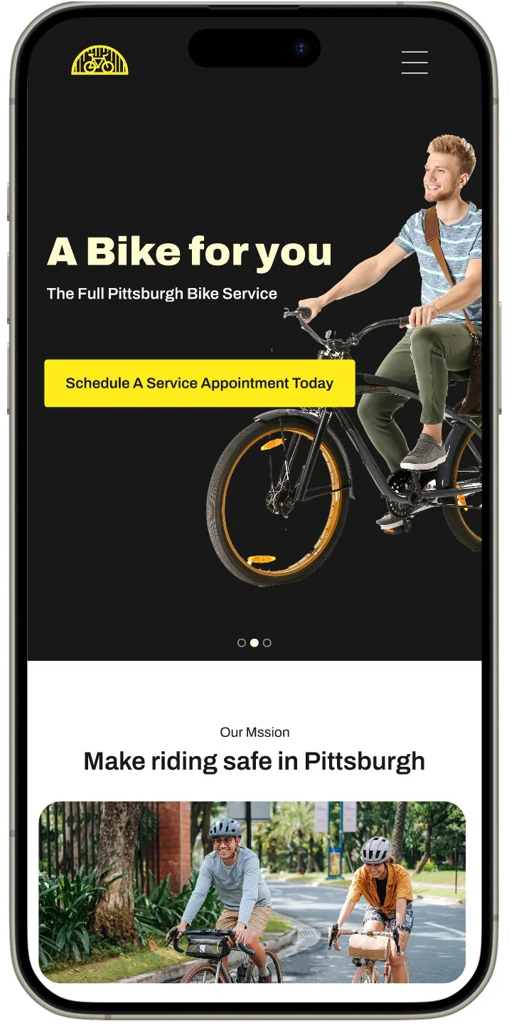
Home -
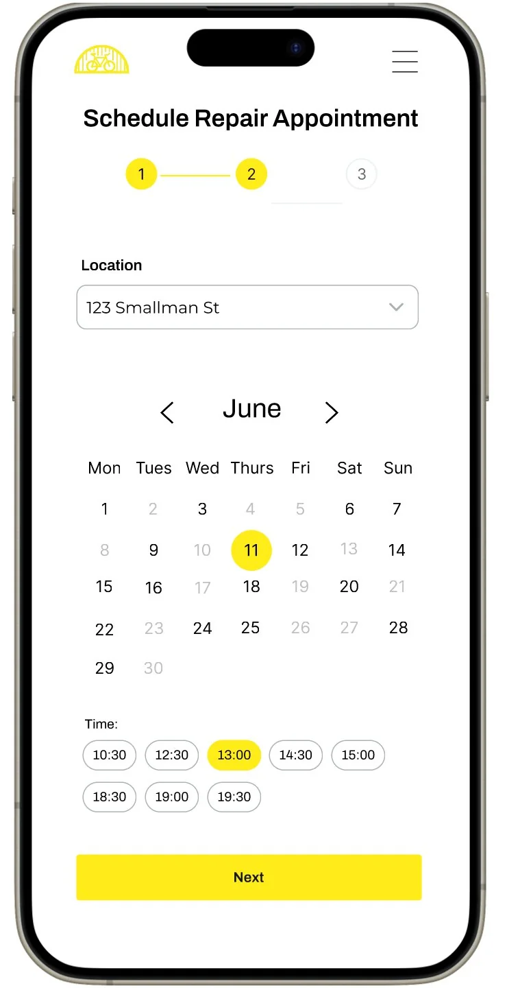
Date & time -
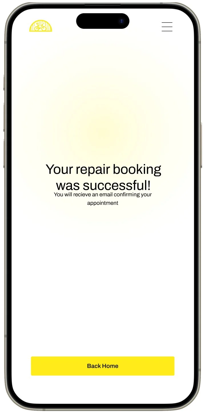
Confirmation
Project summary
A team of four designed a website for a theoretical local Pittsburgh bike shop. We created personas and scenarios to ground the design in real user needs, then selected one scenario to focus on. From there we built wireframes, ran a round of user testing, and iterated into a final high-fidelity prototype.
We centred the work on the tire repair scheduling flow — making it as quick, easy, and painless as possible for someone who depends on their bike daily.
- Team of 4
- Pittsburgh, PA
- Persona & scenario
- Wireframing
- User testing
- Interactive prototype
Persona
John Baker — construction worker, age 28
John lives in the city with no room for a car. He bikes to construction sites carrying everything in a backpack. When something breaks, he needs a fast and affordable fix with minimal friction.
-
Job
Construction worker
-
Gear
iPhone, backpack, tool belt
-
Transport
Depends on his bike daily
-
Need
Fast, easy access to repairs
I depend on my bike to get around. I need a durable bike and easy access to repairs.
Scenario
John rode over a sharp object at a job site and got a flat tire. He needs to schedule a repair as quickly as possible. This is the journey the whole design was built to serve.
John gets a flat tire after riding over a sharp object at the construction site.
He visits the bike shop's website and navigates to repairs via the nav bar or a homepage call to action.
He reads about the repair process and learns about pricing and loaner bike availability.
He fills out step 1 of the scheduling form — selecting repair type, bike brand, and model.
He selects a location, then picks a date and time using the calendar and time slot picker.
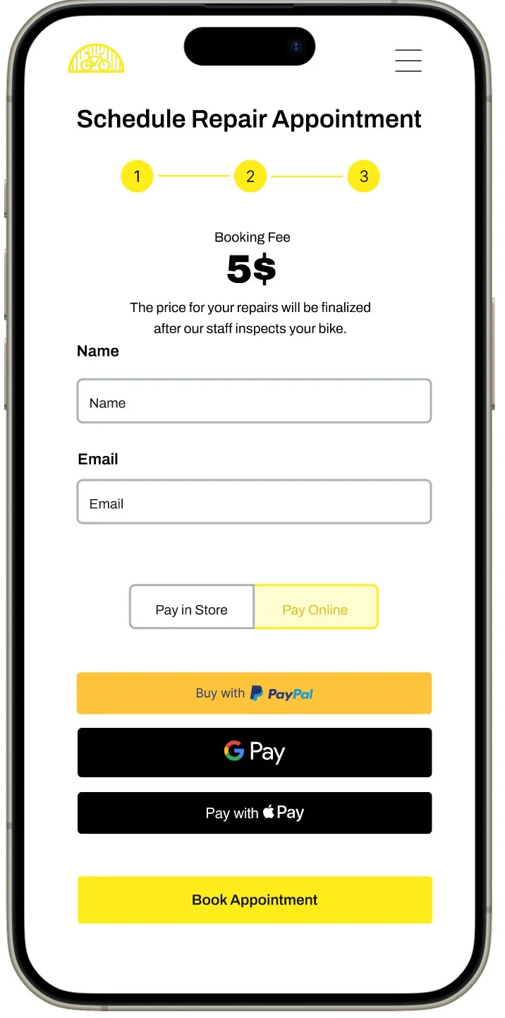
He enters his name and contact info, pays a $5 booking fee, and confirms the appointment.
He receives a confirmation email with his appointment details.
He brings his bike in at the agreed time for the repair.
When the repair is complete, he receives a notification that his bike is ready for pickup.
Wireframes
We wireframed all key screens before moving to visual design, keeping layouts simple and focused on the scheduling flow.
-
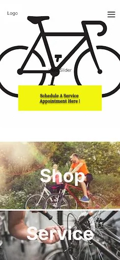
Home -
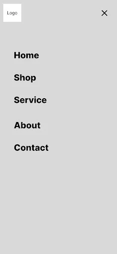
Hamburger menu -
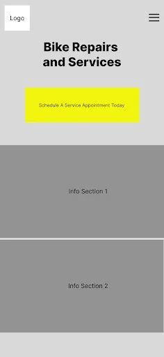
Repairs home -
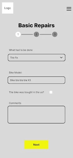
Step 1 — Repair type -
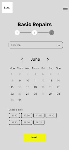
Step 2 — Date & time -
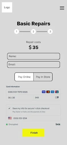
Step 3 — Payment -
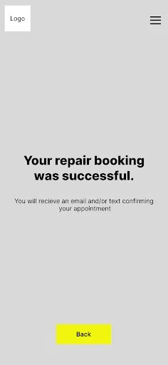
Confirmation
Wireframe decisions
We focused on reducing friction at every step of the scheduling flow.
-
A hero slider with a prominent call to action on the homepage lets users reach the repair flow in one tap.
-
The scheduling flow is split into three discrete steps — repair type, location and date/time, then contact and payment — to keep each screen focused.
-
The calendar only reveals available times after a location is selected, preventing confusion from blocked-out dates.
-
Users can choose to pay online or in store, giving flexibility for those unsure of the final cost upfront.
User testing
Participants navigated the wireframes with minimal difficulty, but testing surfaced two issues that shaped the final design.
Issues found
- The "Schedule a Service Appointment Today" call to action was misleading — it sent users directly to basic repairs only.
- Users were uncertain about repair costs before bringing in their bike.
Changes made
- Removed the confusing services call to action — with only two repair options it wasn't needed.
- Switched to a $5 reservation fee model, with the remainder paid after the bike is inspected.
Both fixes are visible in the screens below. The generic button on the repairs page became a specific "Schedule a Bike Repair", the step 1 heading changed from "Basic Repairs" to "Schedule Repair Appointment", and the upfront $35 quote became a $5 booking fee with the balance settled after inspection.
Final prototype
The final prototype was designed around a Pittsburgh aesthetic — bold black and yellow branding with a local feel. The screens below cover the complete repair scheduling journey.
-
Home -
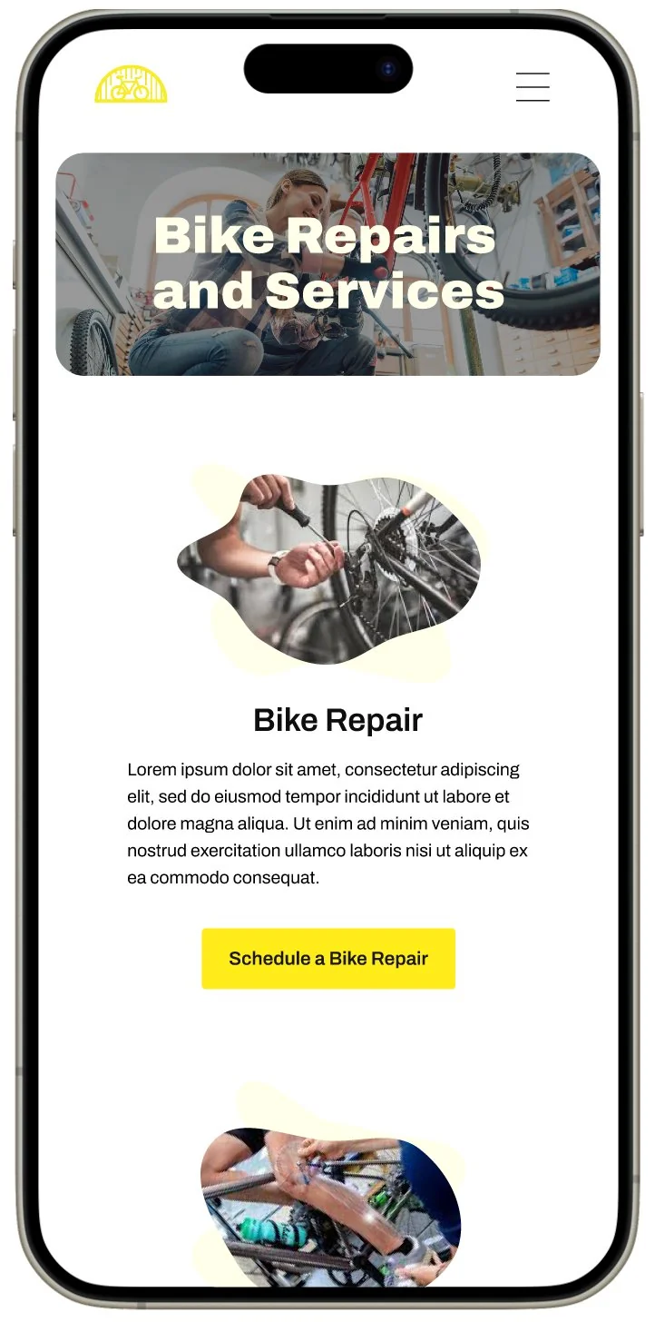
Repairs home -
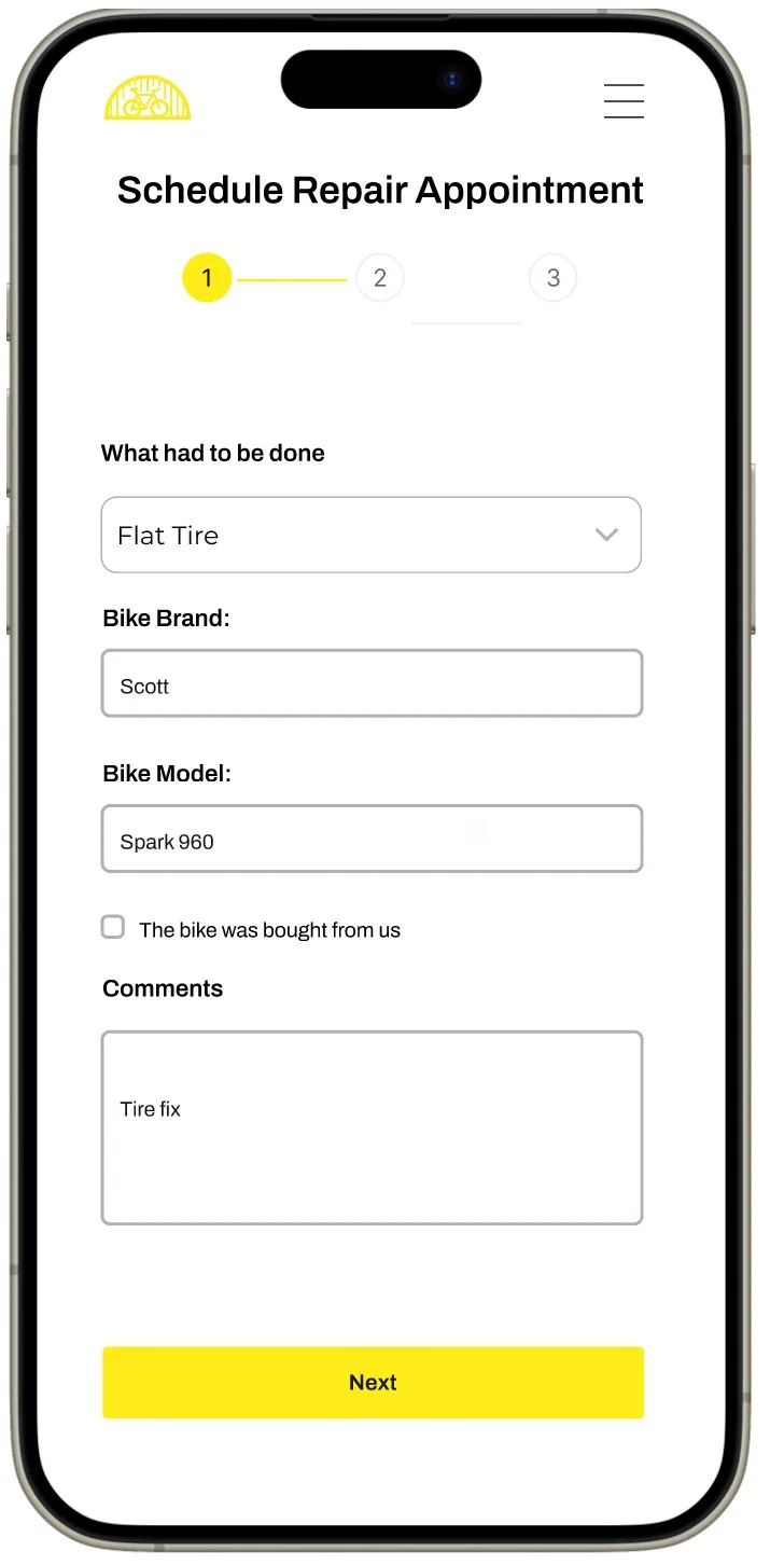
Step 1 — Repair type -
Step 2 — Date & time -
Step 3 — Payment -
Confirmation
What I learned
This project reinforced how much user testing can change a design — even small usability issues, like a misleading call to action label, can meaningfully disrupt a user's flow. Catching that early in the wireframe stage made it straightforward to fix before we invested time in high-fidelity visuals.
Working through a full persona and scenario before touching the interface also made our design decisions feel more grounded. Rather than guessing what a user might need, we had a specific person and situation to design for — which kept the team aligned and made tradeoffs easier to reason through.
On the collaboration side, splitting the scheduling flow into distinct steps was something we debated as a team before committing to it. Seeing users navigate it smoothly in testing validated that decision, and it was a good reminder that clarity often matters more than brevity when stakes are low but confusion is costly.
The project also highlighted that good UX doesn't stop at the screen — it has to account for the real world the user lives in. Offering both online and in-store payment options for the booking fee is a simple example: not everyone wants to enter card details on their phone. Bridging that gap between the digital experience and the physical visit made the product feel more trustworthy and considerate of how people actually behave.