UX Design • Case Study
The Animal Network
-
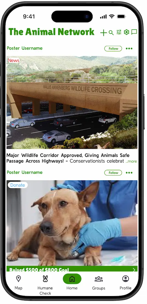
Home feed -
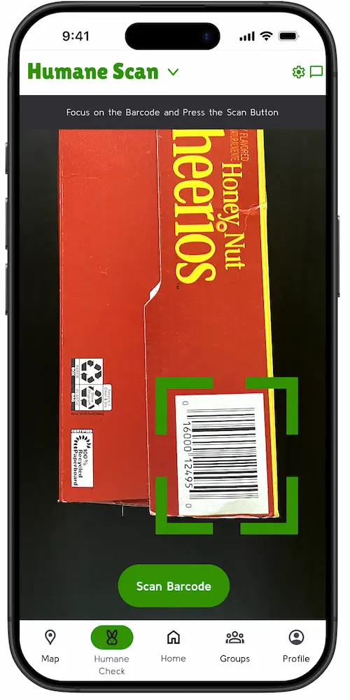
Humane Scan -
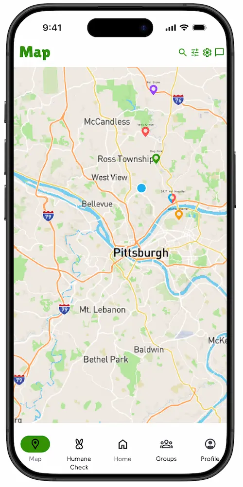
Map
Project summary
A mobile app designed to connect animal welfare organizations with volunteers, donors, and advocates — giving the people working to help animals the tools and support they need. I ran the project solo, from an interview with a farm sanctuary director through competitive analysis, two rounds of wireframes, and two rounds of high-fidelity prototypes, with user testing driving structural change at every stage.
- Solo project
- Mobile app
- Figma
- User interview
- Competitive analysis
- User testing
- Material Design 3
The problem
Animals are suffering from mistreatment across the world, and the organizations working to change that often lack sufficient volunteers, funding, and public support. Existing tools are scattered across multiple apps — none of them built specifically for animal welfare advocacy.
My research focused on factory farming and animal testing. 99% of US livestock is raised on factory farms, and 110 million animals are killed in US laboratories every year. I also conducted an interview with Karen Phillips, who runs Hope Haven Farm Sanctuary in Sewickley, PA — a conversation that grounded the entire project in real, specific needs.
She used to seek out animals to bring to her sanctuary, but now has to turn them away due to insufficient funding and volunteers. Social media is their best source of funding — she's not sure the sanctuary would have survived without Facebook.
Ms. Phillips also noted that donations decline during election years and have been down since COVID-19, and that education was the most powerful long-term tool for improving animal welfare.
Competitive analysis
I conducted case studies of two existing apps to understand what was already working and where there were gaps to fill.
-
Petfinder
The largest online pet adoption platform in North America. Lets users search for animals, filter by traits, and contact shelters directly.
What I took
- Rich search and filtering (breed, size, traits, location)
- Recent search history for easy resuming
- In-app messaging as standard
What I left behind
- Purina ads embedded in animal profiles
- Filters only accessible after making a search
- No minimum info requirements for shelters
-
Cruelty Cutter
Lets users scan barcodes or search a database to check if a product or company is cruelty-free. Made by the Beagle Freedom Project.
What I took
- Fast, efficient barcode scanning
- Search and browse database as a backup
- Concept of showing associated brands
What I left behind
- Limited info — only cruelty-free yes/no
- Donation flow redirects to external website
- No sources cited for cruelty claims
A key principle carried into my design: no advertisements, and products shown only on merit — a direct response to Petfinder's Purina-driven model.
Key features
-
Home feed
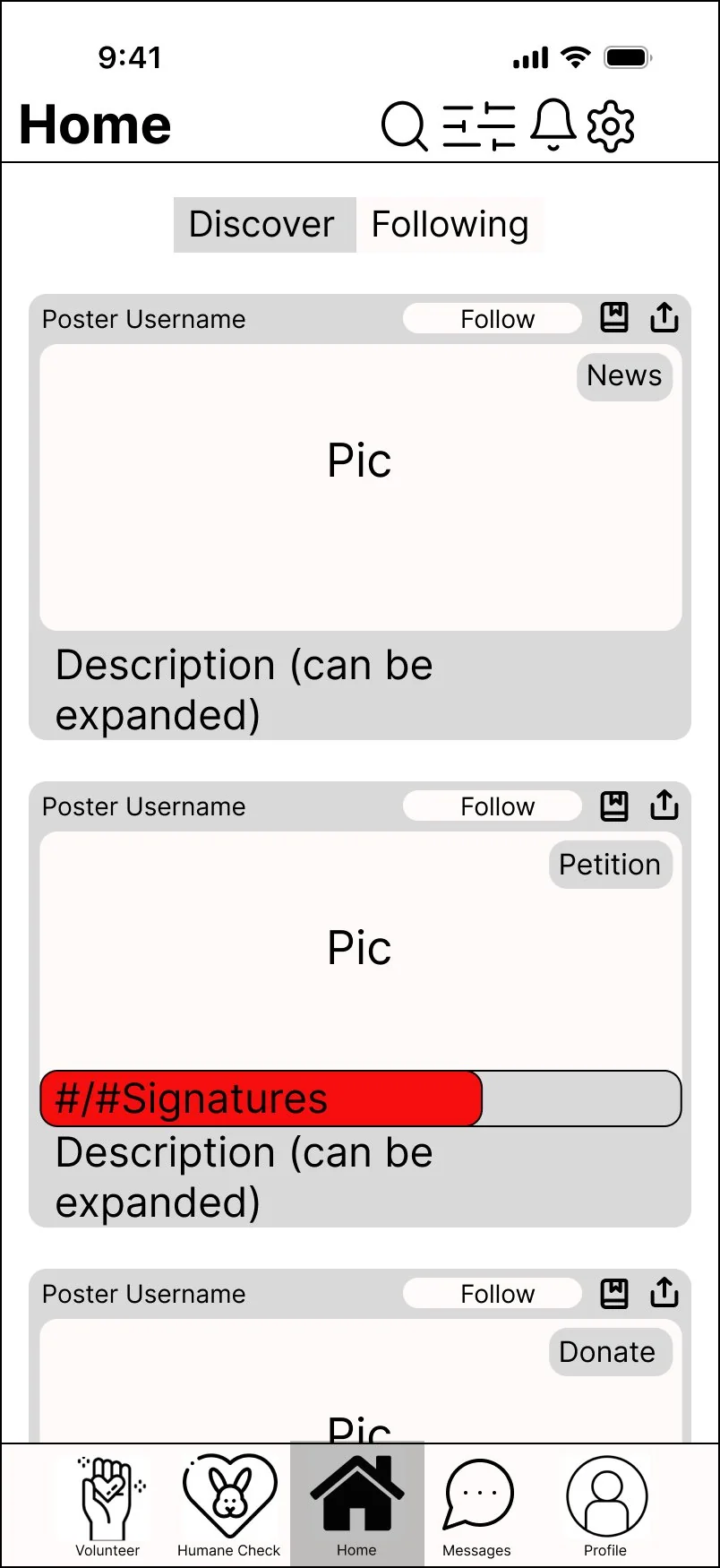
A unified feed of color-coded post types — news, volunteering, events, donations, and petitions — giving users one place to discover and act.
-
Humane Check
Scan a barcode or search by company name to get an A–F humane rating, toxic ingredient info, source citations, and alternative product suggestions.
-
Groups
Community groups connecting people passionate about specific issues, enabling local advocates to organize campaigns and events.
-
Map
A location-based map showing nearby animal hospitals, shelters, sanctuaries, and parks.
-
Profiles
Individual and organization profiles with posts, groups, and activity — verification required before any organization can receive donations.
Wireframes
I produced two rounds of wireframes before moving to high-fidelity prototypes, with user testing between each round driving significant structural changes.
Round 1 — Initial wireframes
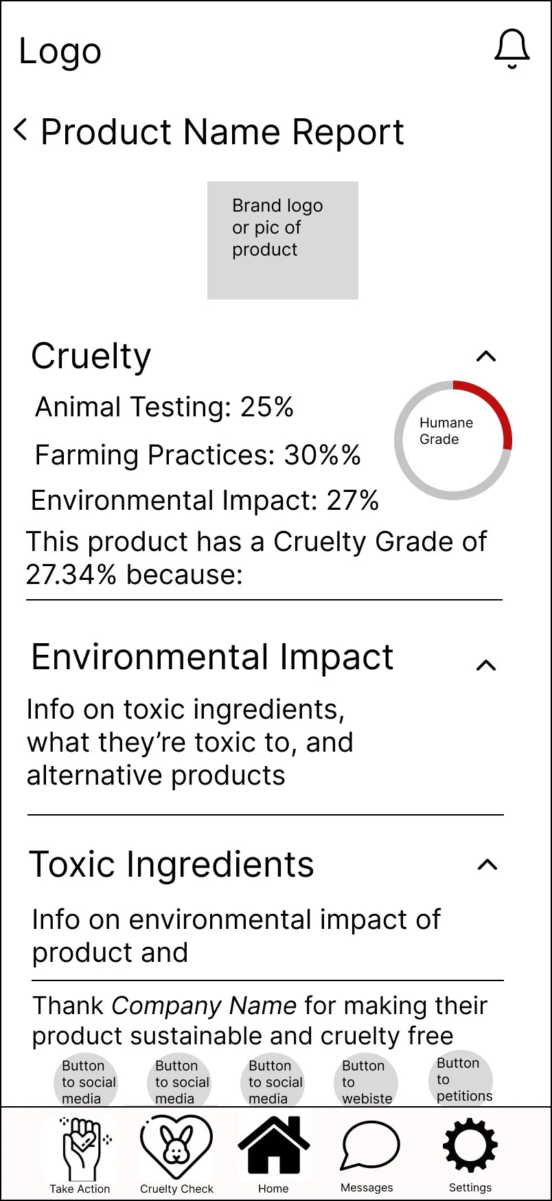
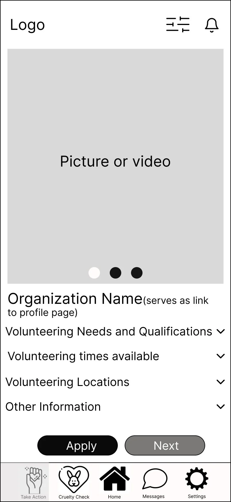
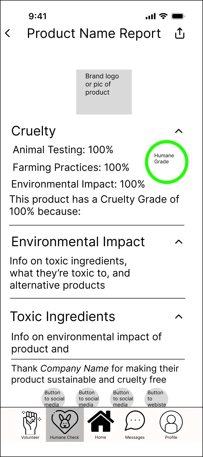
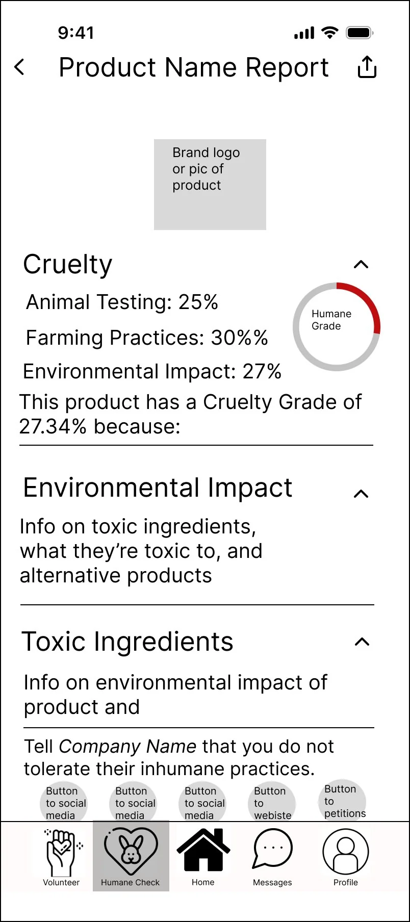
The homepage was divided into separate category sections (News, Volunteering, Donate, Petitions) which users found overcrowded. Volunteering and Donate each had their own spots on the bottom bar as standalone features. The Cruelty Check used a percentage grading system that confused testers, and the database was displayed as a simple alphabetical list.
-
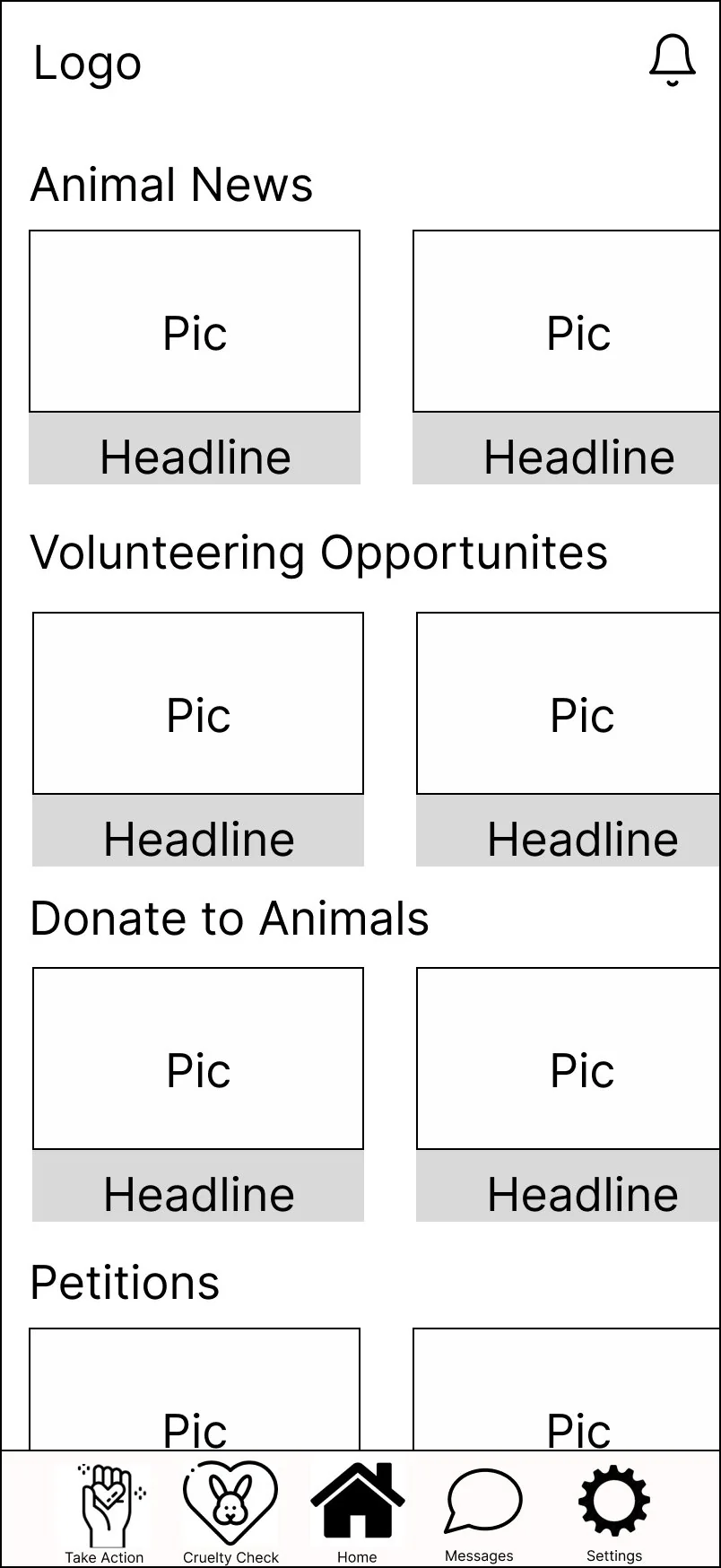
Home -
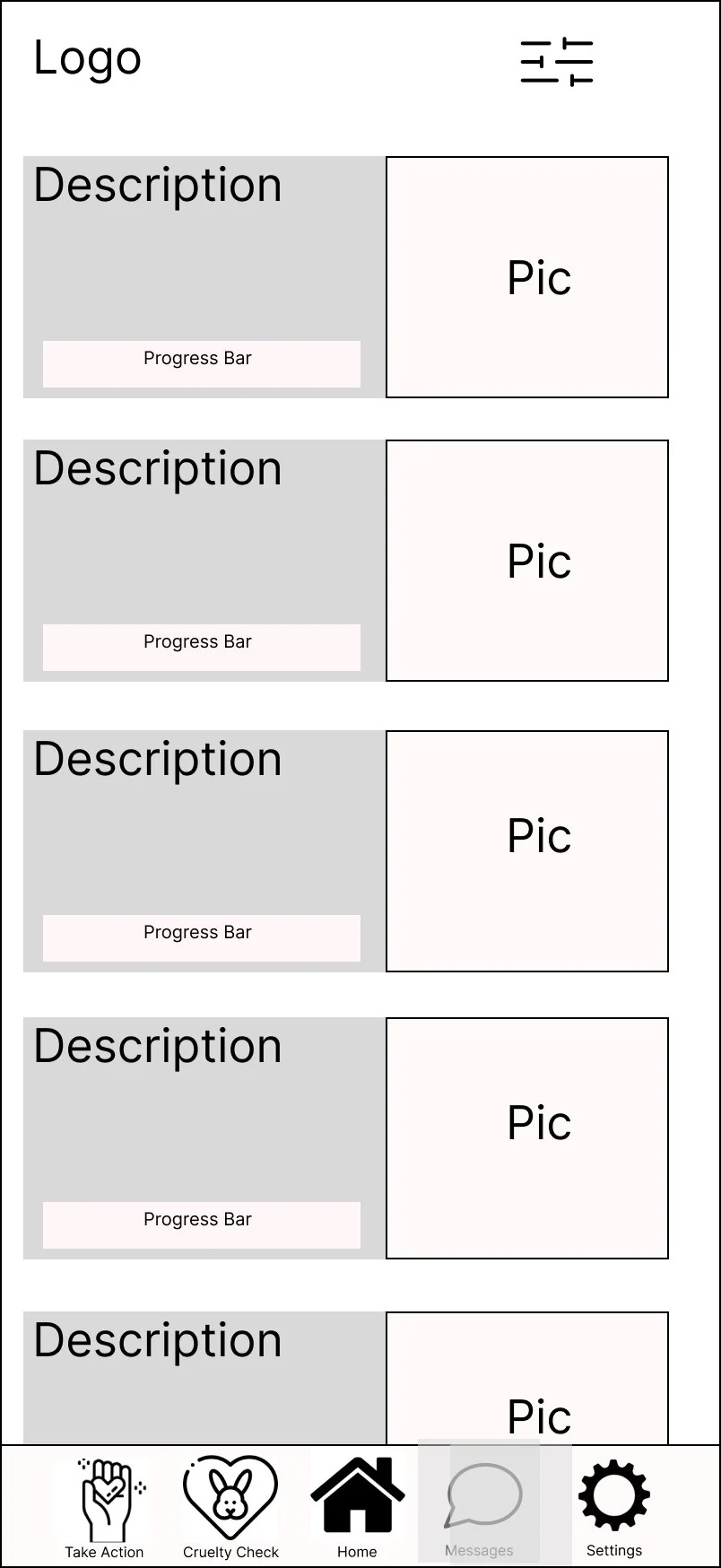
Donate feed -
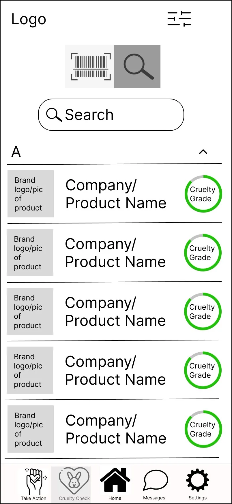
Cruelty search -
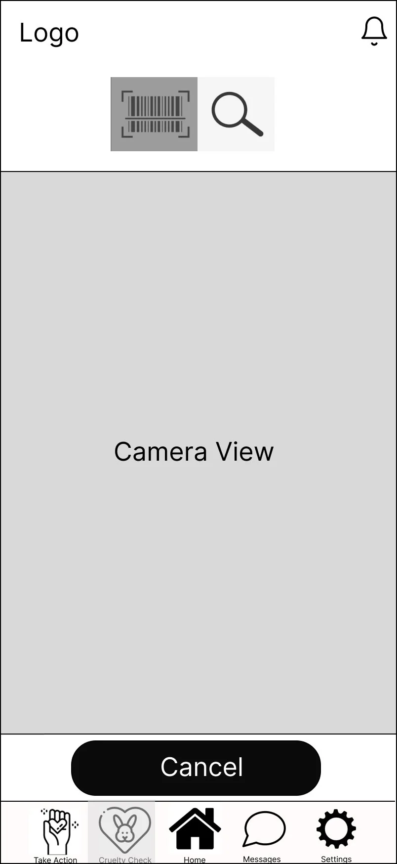
Barcode scan -
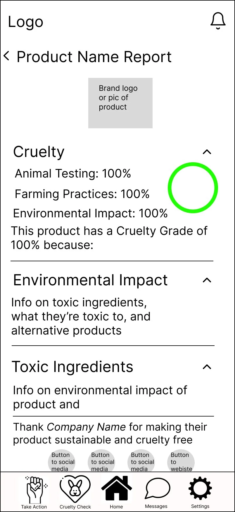
Report (humane) -
Report (not humane) -
Volunteer post
Round 2 — Revised wireframes
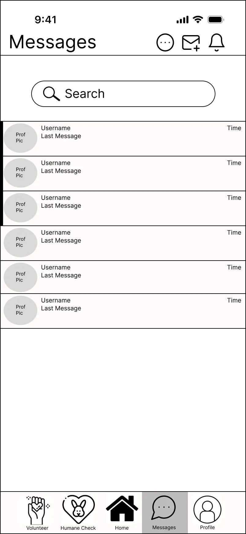
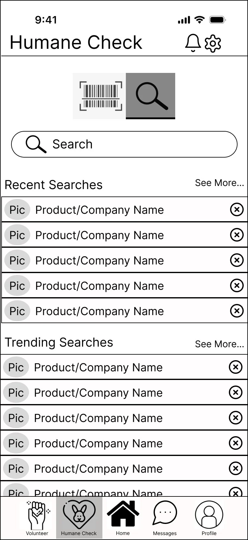
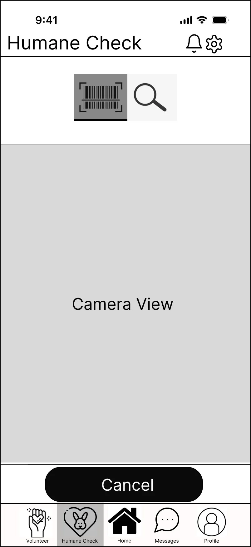
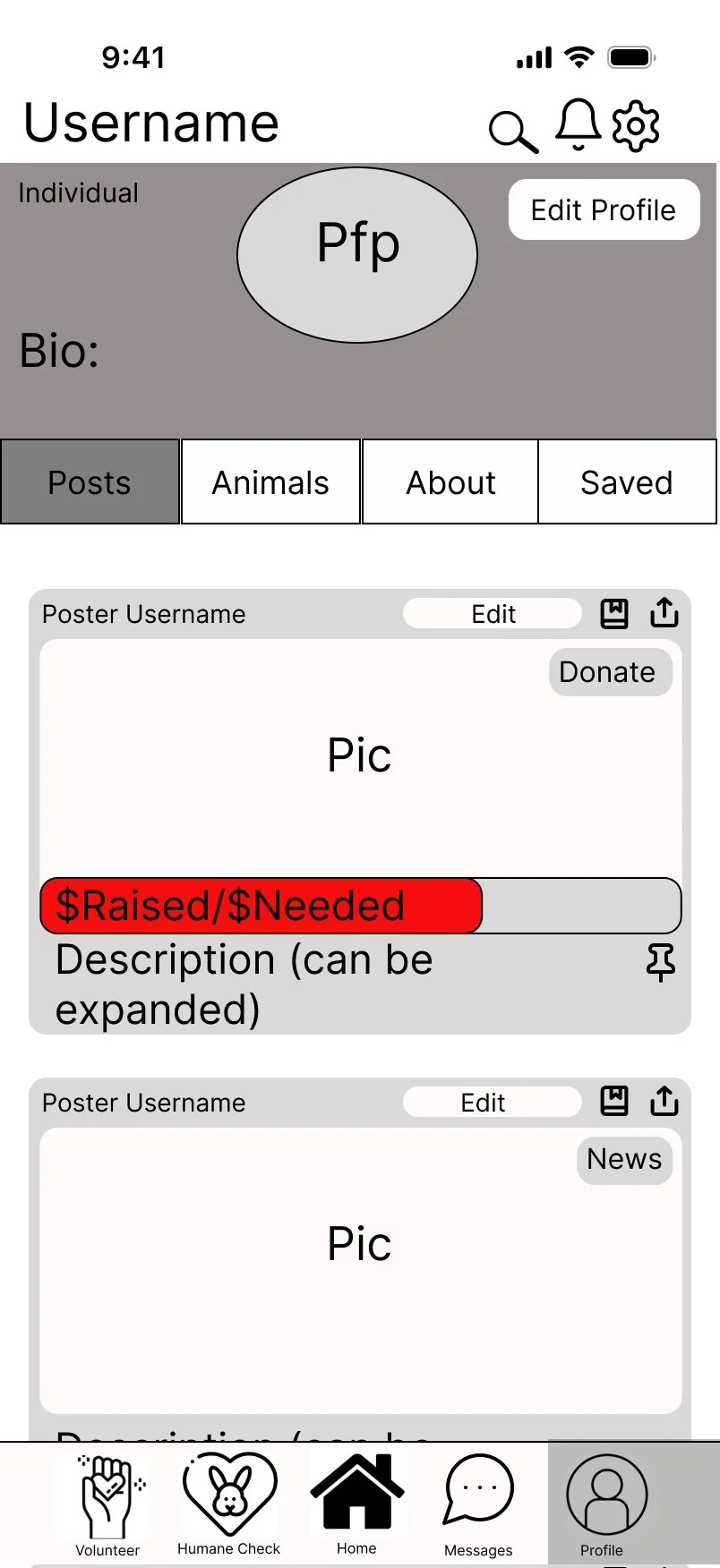
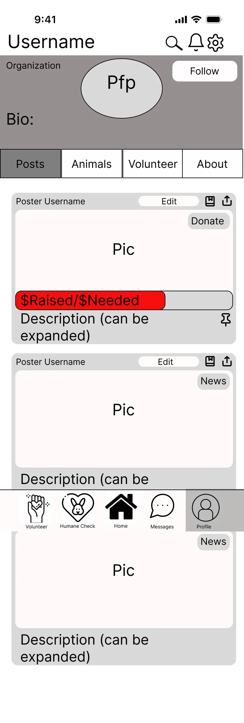
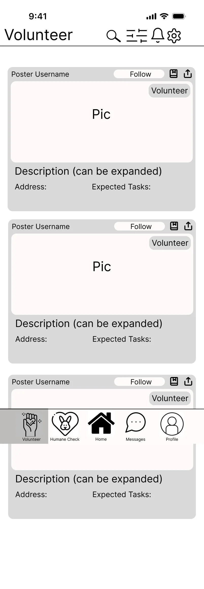
The biggest structural change was consolidation. Volunteering and Donate were merged into a single unified home feed with color-coded post type tags — eliminating two separate bottom bar tabs and simplifying navigation significantly. "Cruelty Check" was renamed "Humane Check" and the scan and search modes were combined into one screen with a toggle, replacing what had been separate entry points. The alphabetical product list was replaced with recent and trending searches. Separate individual and organization profile layouts were introduced, and Messages was added as a core feature.
-
Home feed -
Messages -
Humane search -
Humane scan -
Report (humane) -
Report (not humane) -
Profile (individual) -
Profile (org) -
Volunteer feed
Prototypes
Two rounds of high-fidelity prototypes were built in Figma using the Google Material Design 3 kit, with the green color scheme established in the first round and carried through to the final.
Prototype 1
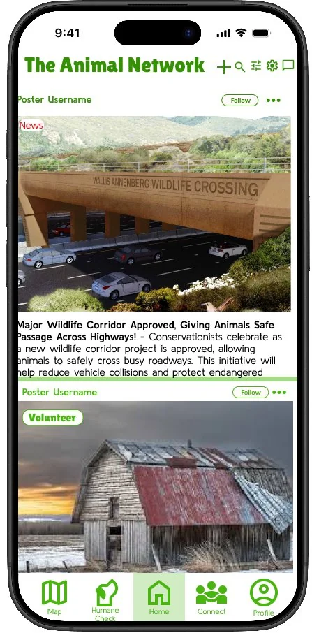
The first prototype applied the green color scheme and Material Design 3 components to the wireframe 2 structure. The map feature was added, and Groups was introduced. The Humane Grade still showed the percentage alongside the letter grade at this stage — this was refined in prototype 2 based on further testing.
-
Home -
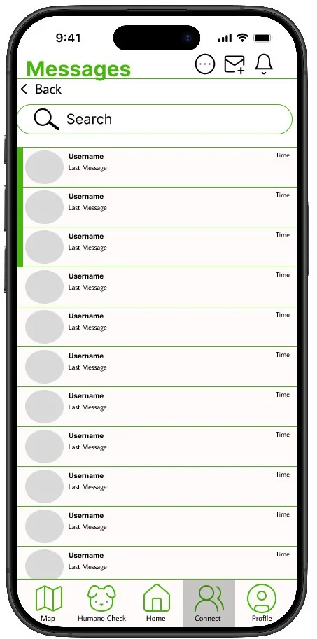
Messages -
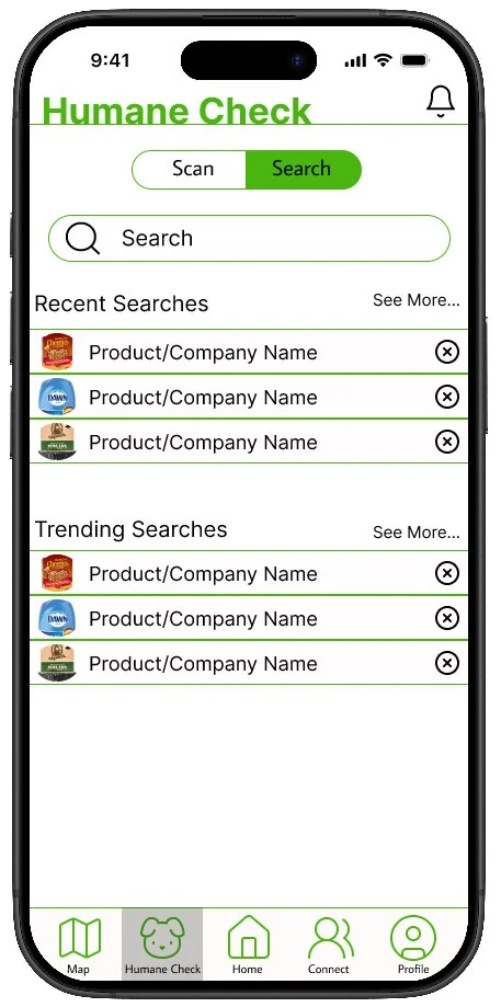
Humane search -
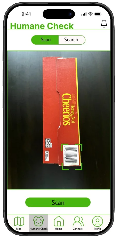
Humane scan -
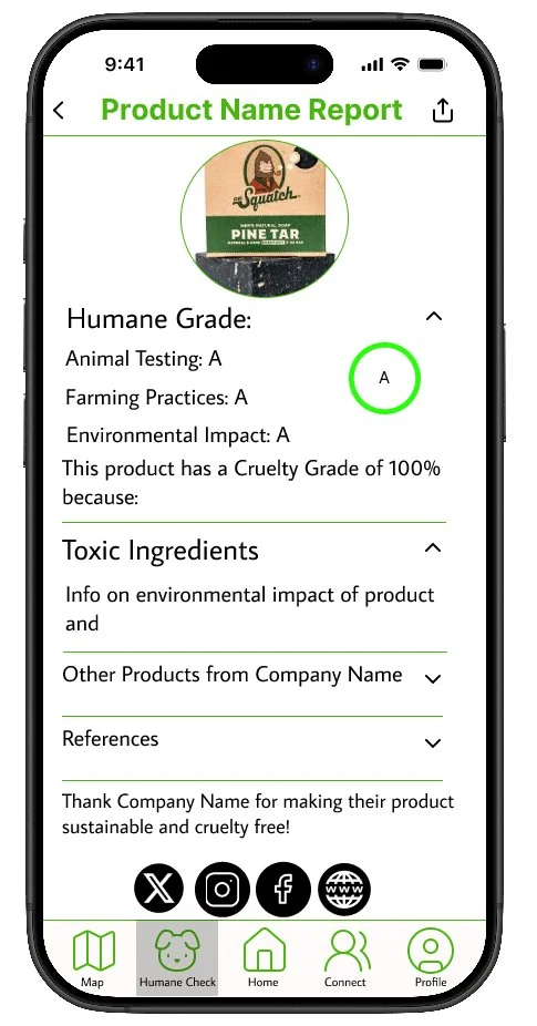
Report (humane) -
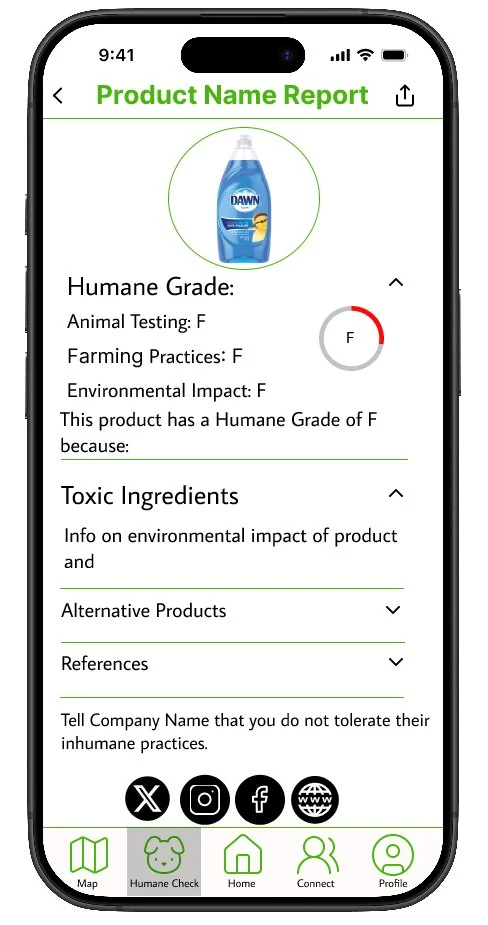
Report (not humane) -
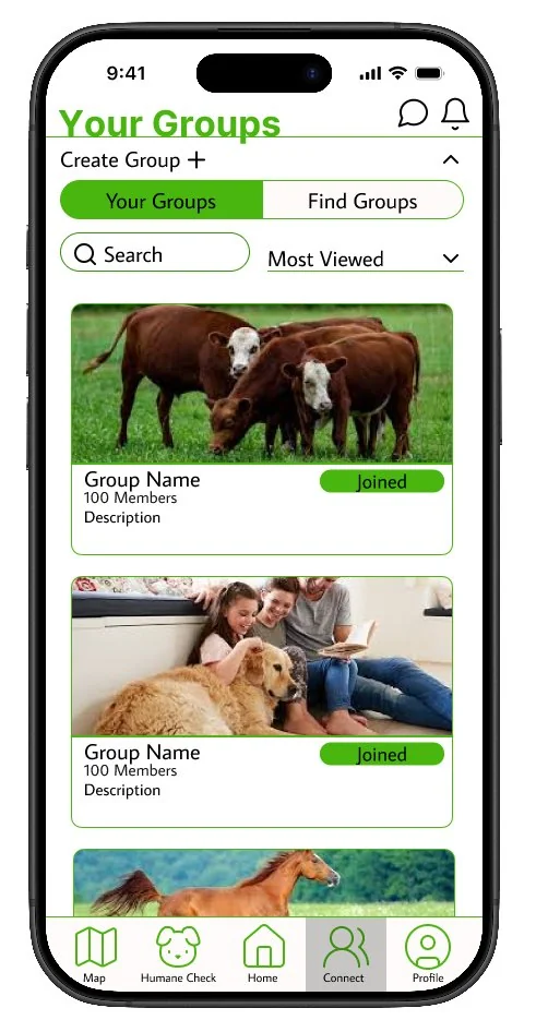
Your groups -
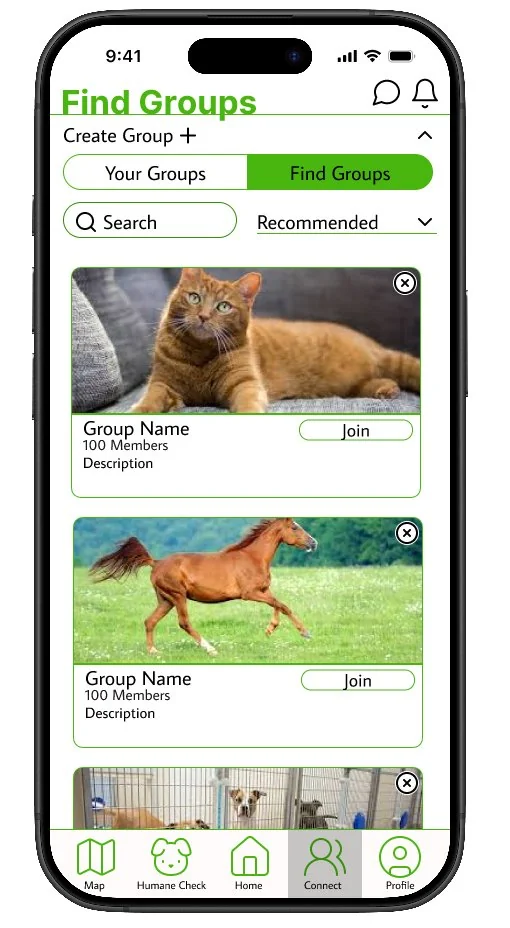
Find groups -
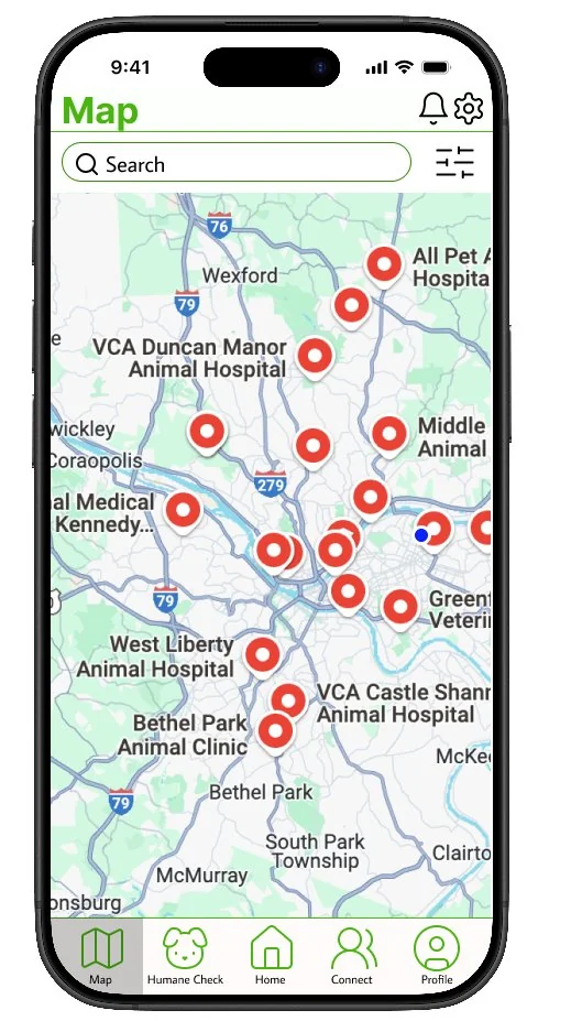
Map -
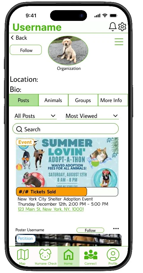
Profile
Prototype 2 — Final
The final prototype refined the Humane Check grading to letter-only (removing the confusing percentage), polished the profile design, and improved filters and UI components throughout. The nav bar was restructured and the overall visual polish was significantly elevated.
-
Home feed -
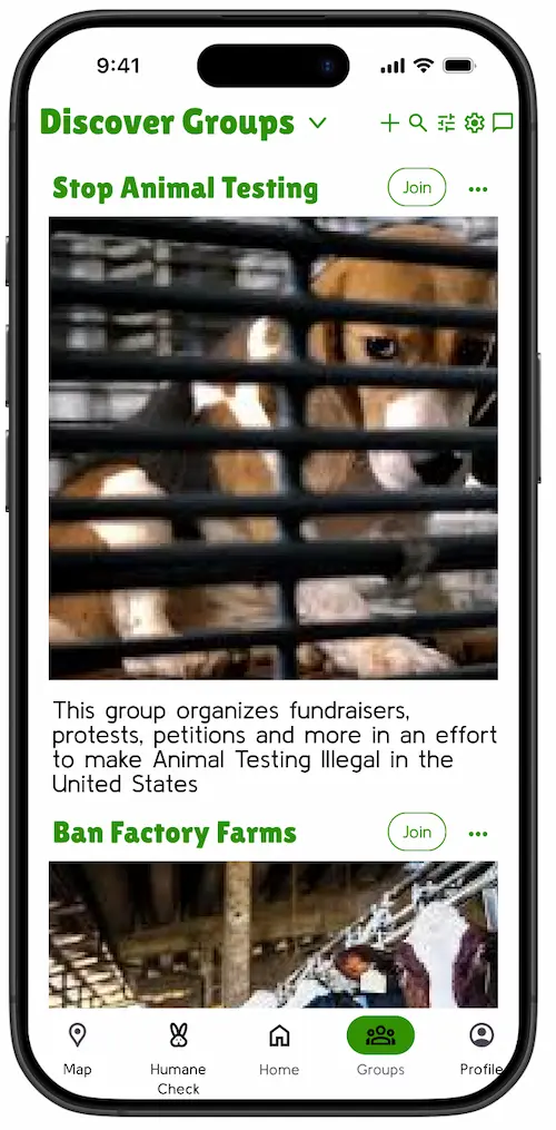
Groups -
Map -
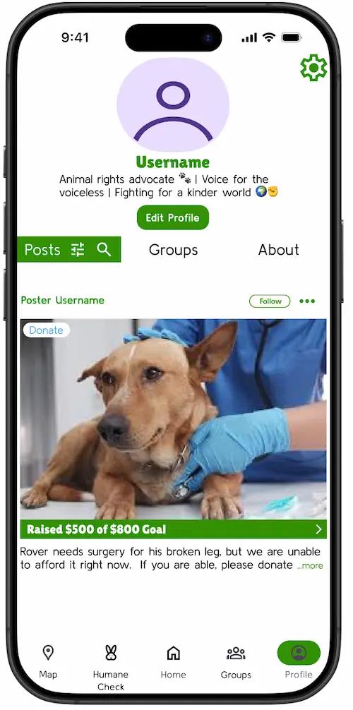
Profile -
Humane Scan -
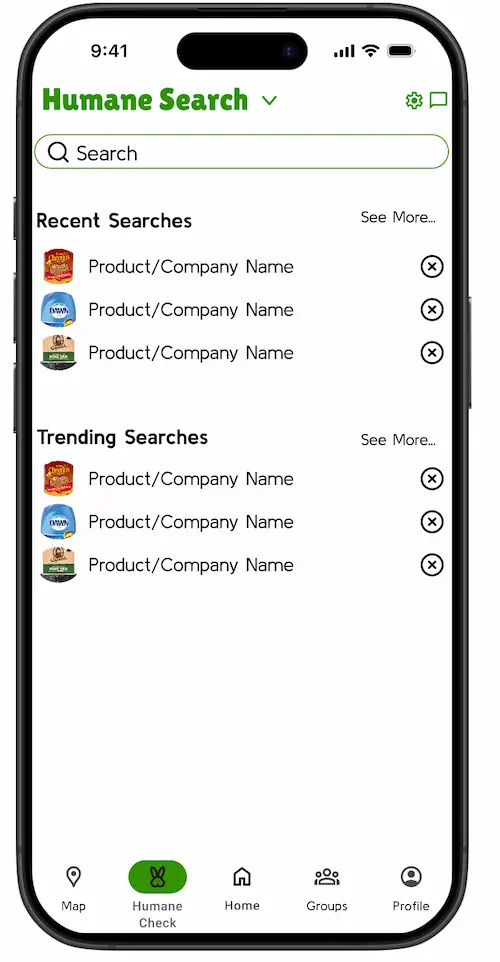
Humane Search
User testing
Issues found
- Original homepage was too crowded with too many separate sections
- Post type tags in the corner were easy to miss
- The percentage "Cruelty Grade" confused users — they didn't know if higher was better or worse
- Alphabetical product list in Humane Search wasn't useful
- Profile pages felt cluttered in early iterations
Changes made
- Replaced sectioned homepage with a unified vertical feed
- Moved tags to top left with solid color backgrounds
- Renamed to "Humane Check" with an A–F letter grading scale
- Replaced alphabetical list with recent and trending searches
- Removed clutter from profiles and centered key information
What I learned
-
Competitive analysis shaped the product as much as user testing did
Studying Petfinder and Cruelty Cutter showed me what features were worth building on and what pitfalls to avoid — like ads embedded in animal profiles, or grading systems that confused users before they even started.
-
Iterating early and often saved time
User testing consistently surfaced issues I hadn't anticipated, like the confusion around the percentage-based grading system. Testing rough wireframes saved significant time compared to fixing the same problems at higher fidelity.
-
Framing matters as much as function
Renaming "Cruelty Checker" to "Humane Check" reframed the experience around a positive outcome, making the feature feel more approachable and trustworthy.
-
Real-world research shaped the product in ways I couldn't have anticipated from a desk
My interview with Ms. Phillips revealed concrete gaps — like the need for volunteers with construction skills — that grounded the design in actual needs rather than assumptions.
-
Consolidating features often improves the experience more than adding new ones
Merging volunteering and donations into the home feed, and combining the Humane Check scan and search into a single toggled screen, made the app feel simpler and more focused — even though it had more functionality than the original design.
-
Testing outside my own program exposed different problems
Everyone in a design program is technically proficient. A wider testing group revealed navigation issues I would have otherwise missed, and showed where the app needed to be more intuitive and accessible.
What I would do next
The most important next step would be working closely with real animal welfare organizations to test and refine the app. My interview with Ms. Phillips gave me a strong starting point, but partnering directly with sanctuaries, shelters, and advocacy groups throughout the design process would ground the app in the day-to-day realities of the people it's built for — and would likely surface needs I haven't anticipated yet.
I'd also want to add accessibility features I didn't have time to include, like a color blind mode and a dark mode. Designing an app that's inclusive and usable for as many people as possible was a core value of this project, and those features are an important part of delivering on that.
Finally, I'd explore making grants more accessible through the app. I learned during my research that grants can be a significant source of funding for animal welfare organizations, but navigating them is often difficult and time-consuming. A feature that helped organizations find and apply for relevant grants could be one of the most impactful additions to the platform.